WARLOCKS Gym

Service:

Service:

Service:

Brand Identity

Brand Identity

Brand Identity

Client:

Client:

Client:

WARLOCKS Gym

WARLOCKS Gym

WARLOCKS Gym

Field:

Field:

Field:

Health & Wellness

Health & Wellness

Health & Wellness

Year:

Year:

Year:

2025

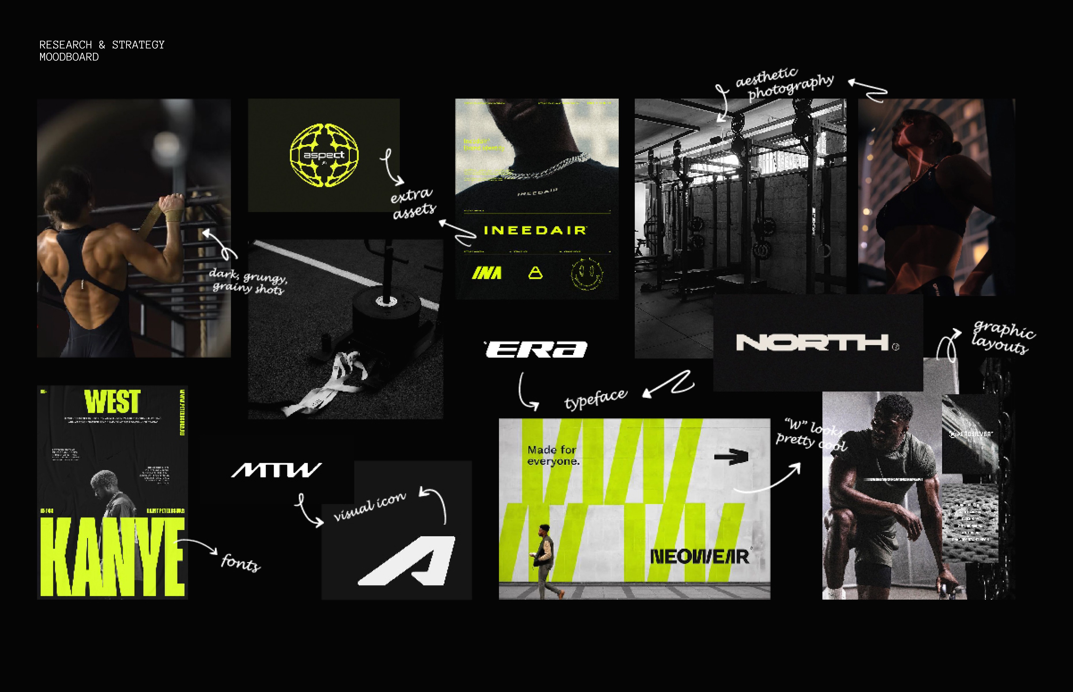
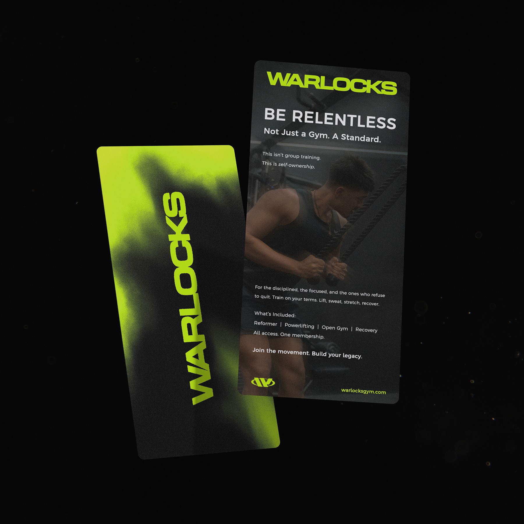
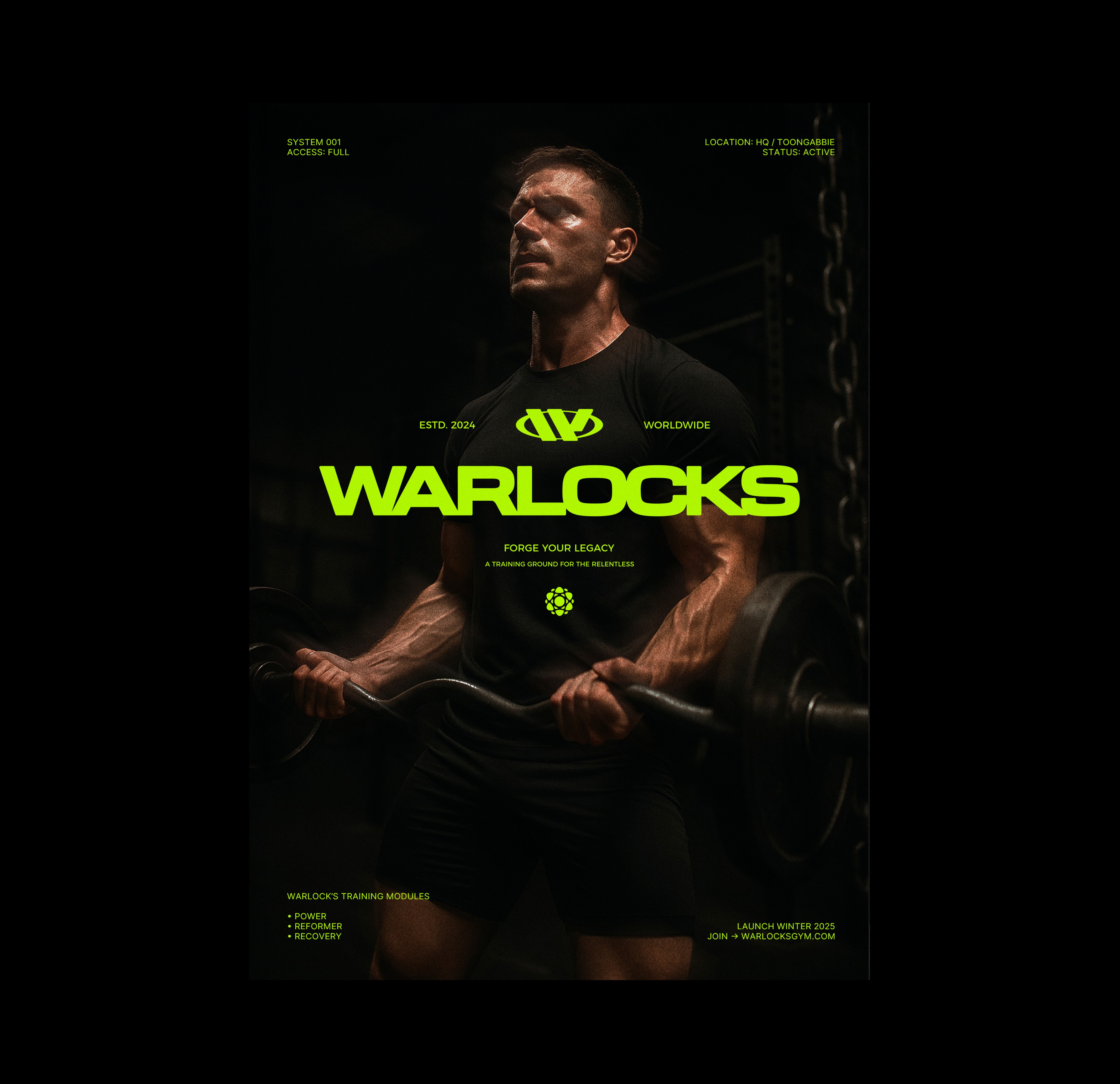
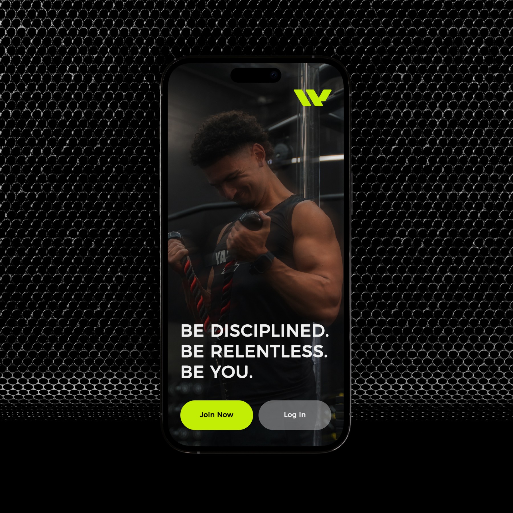
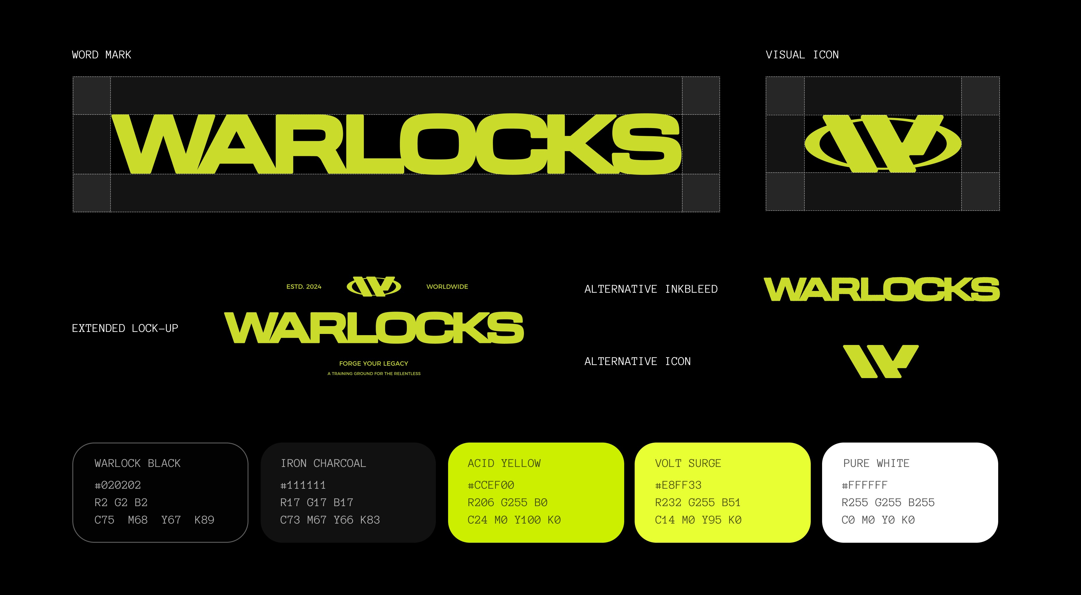
Warlock’s Gym was built to break away from the generic fitness experience, positioning itself as a premium, all-in-one training ground for strength, recovery, and performance. From powerlifting racks to reformer pilates and open recovery spaces, the brand needed to embody aggression, precision, and modern luxury. My role was to craft a complete brand identity system that could live across apparel, interiors, digital platforms, and large-scale environmental graphics.

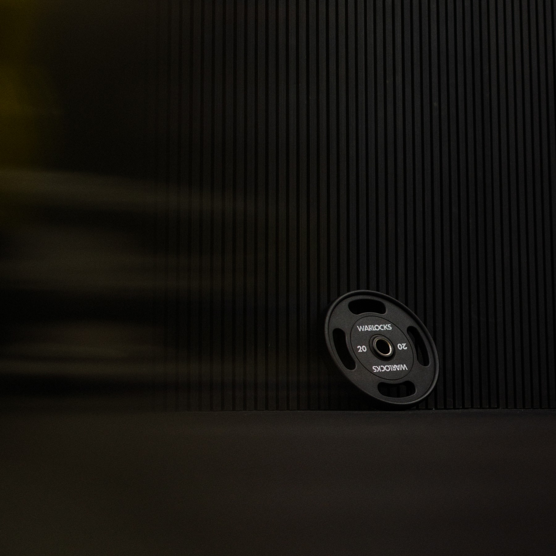
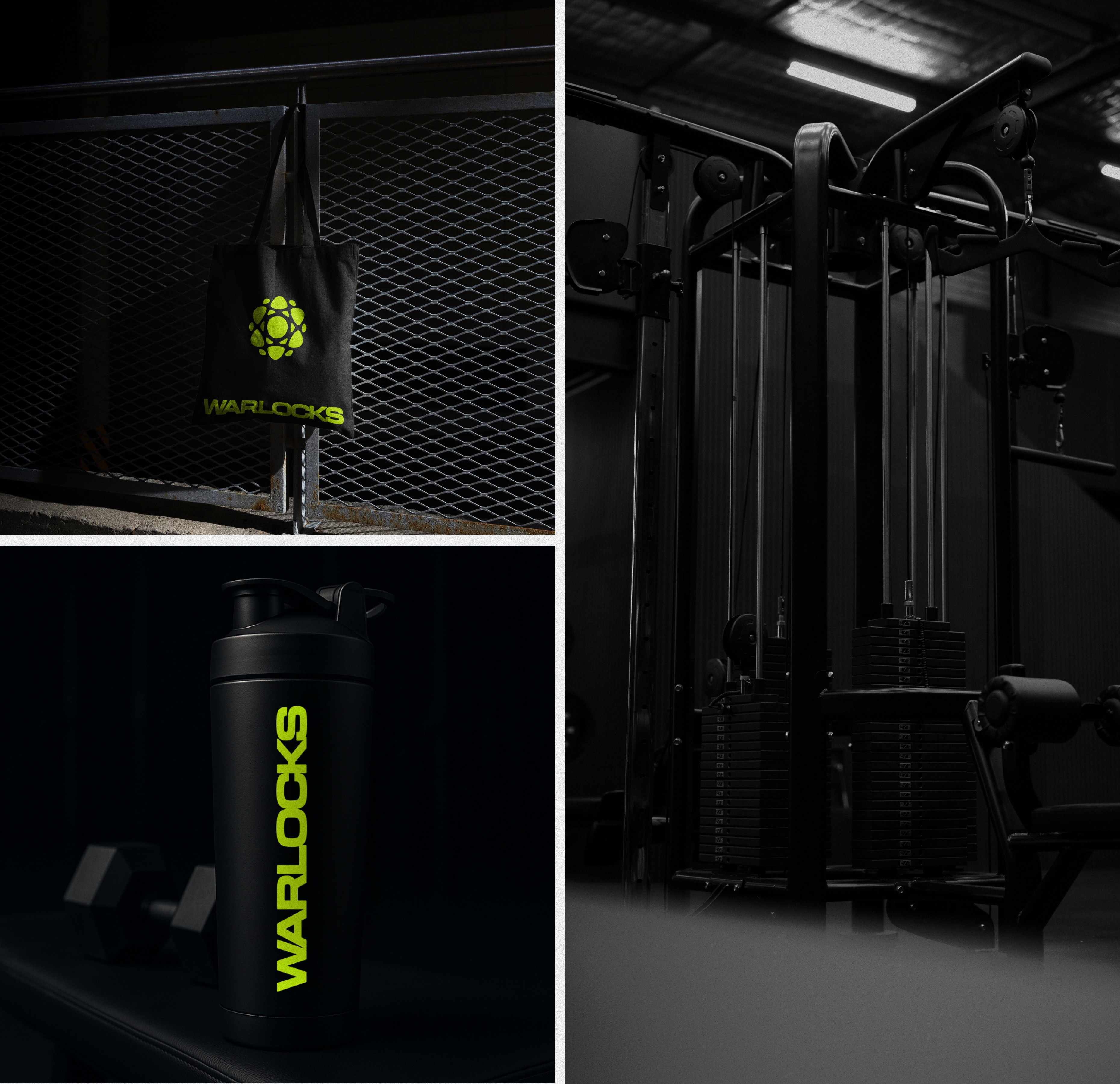
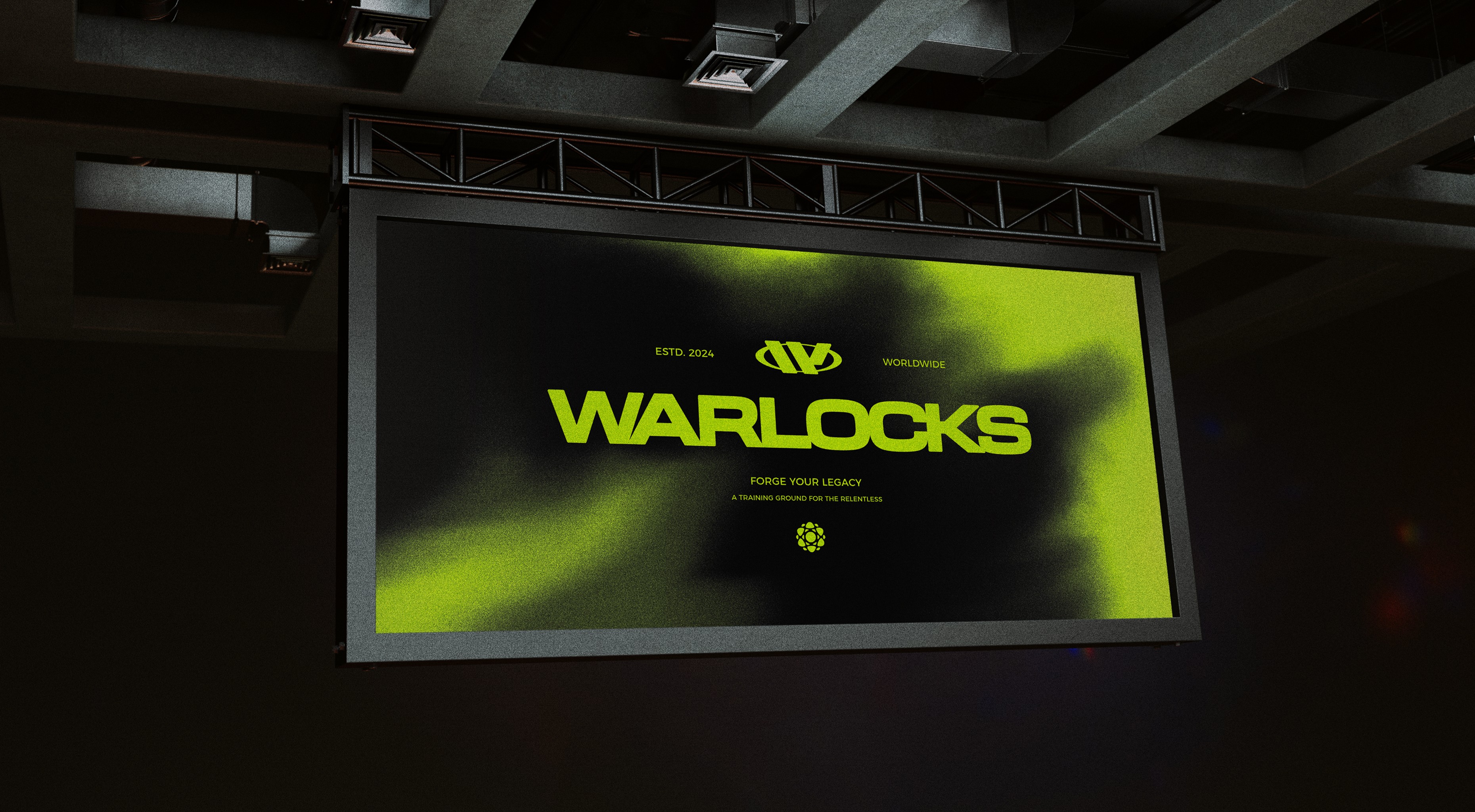
The visual direction leans into bold, masculine energy with a palette of black, white, and Acid Yellow. Every design element, from the logo to signage and gym merch, was built to make Warlock’s instantly recognizable, whether on a barbell, a hoodie, or a 20-foot wall.

Once the foundation was set, I translated the Warlock’s identity into dynamic real-world applications. This included logo lockups, branded uniforms, interior graphics, promotional materials, and a launch-ready visual library. Photography and mockups showcased the gym as an elite training destination, emphasizing both power and accessibility to a wide audience.

Through careful attention to typography, contrast, and spatial application, the Warlock’s brand now feels like a movement rather than just a gym. A bold, unified experience that motivates members the moment they step inside.

Share:

More works