Studio VELÀ

Service:

Service:

Service:

Brand Identity

Brand Identity

Brand Identity

Client:

Client:

Client:

Dom Istephan

Dom Istephan

Dom Istephan

Field:

Field:

Field:

Pilates & Wellness

Pilates & Wellness

Pilates & Wellness

Year:

Year:

Year:

2025

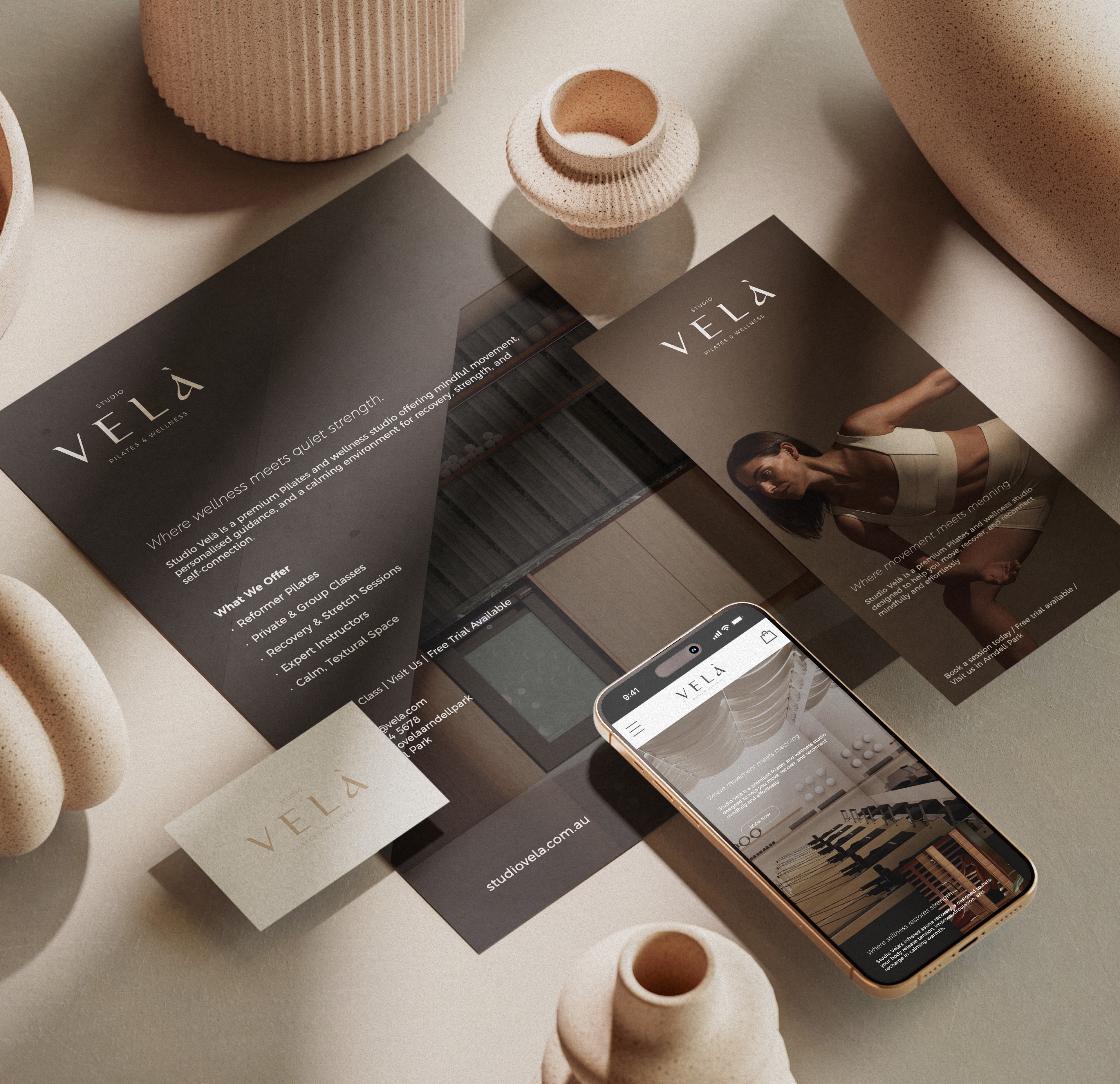
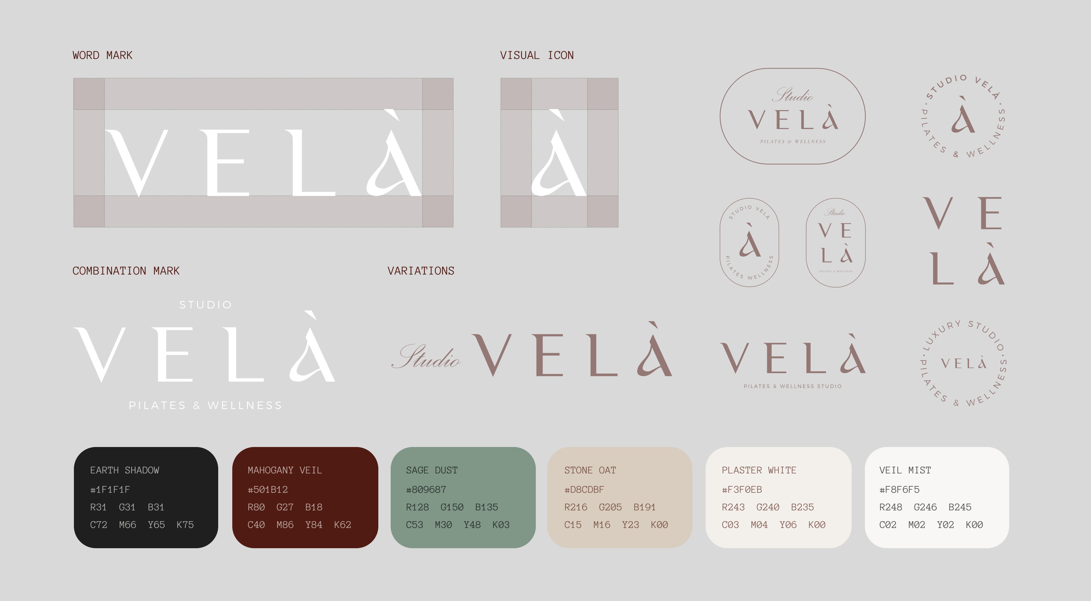
Studio Velà is a premium Pilates and wellness studio rooted in calm, connection, and quiet luxury. My role was to develop the full brand identity system from concept to execution, guiding everything from naming and logo development to visual direction and application. Inspired by the Italian word for candle or flame, ‘Velà,’ I crafted a brand experience that embodied stillness, breath, and transformation. The result was a soft, grounded aesthetic system built on refined typography, neutral palettes, rich textures, and warm minimalism.

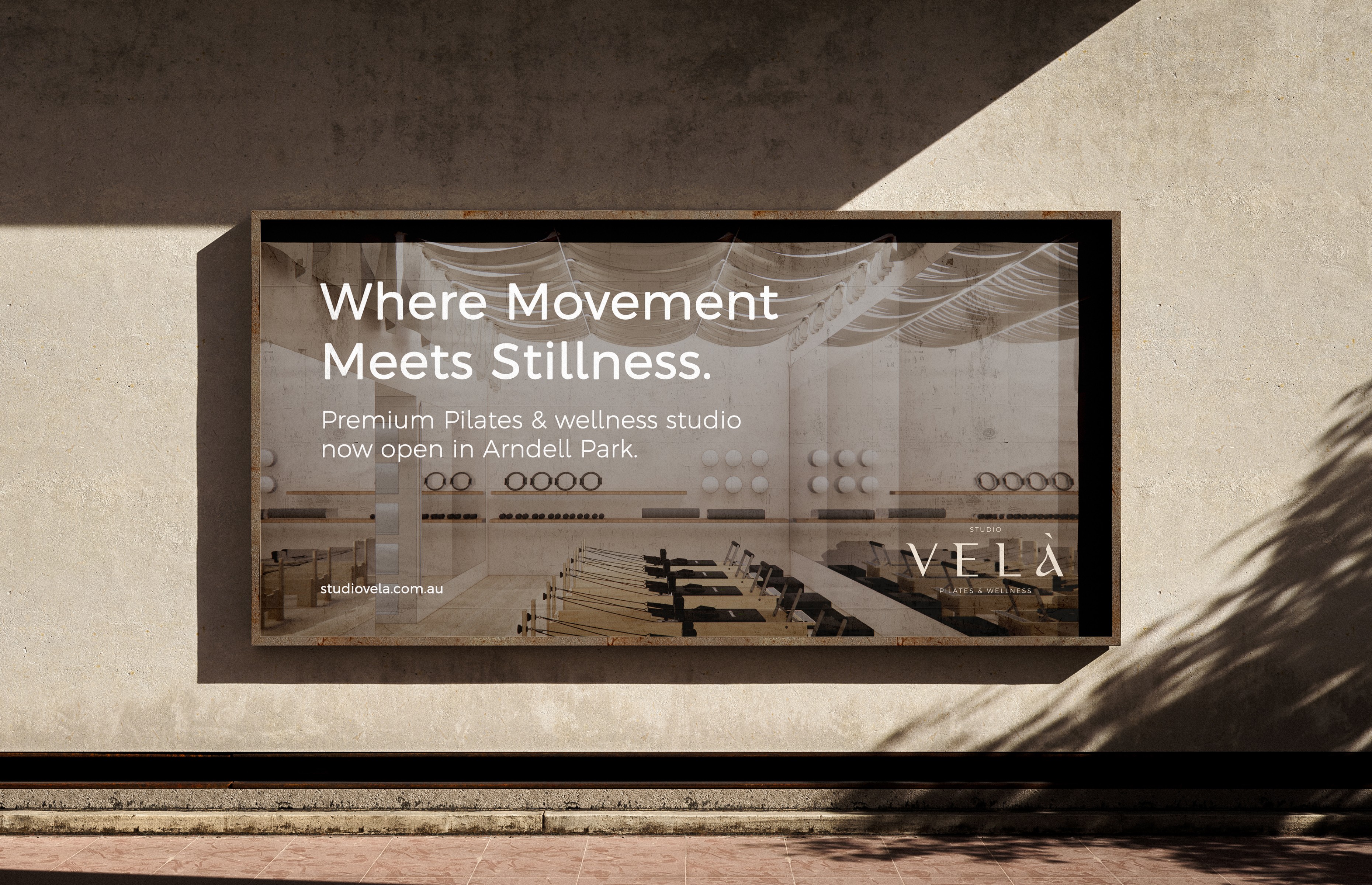
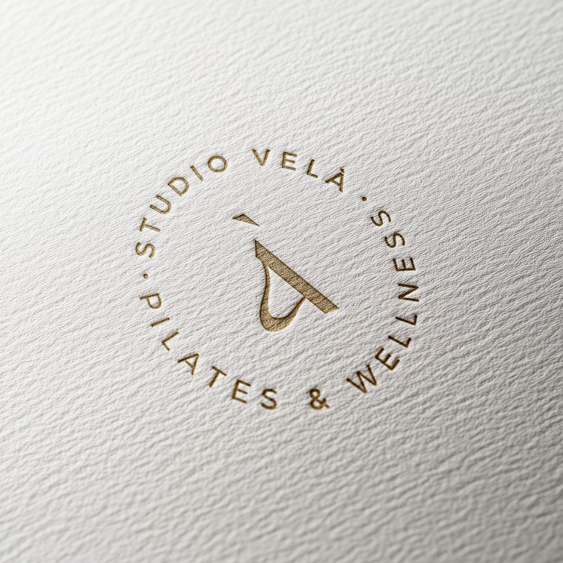
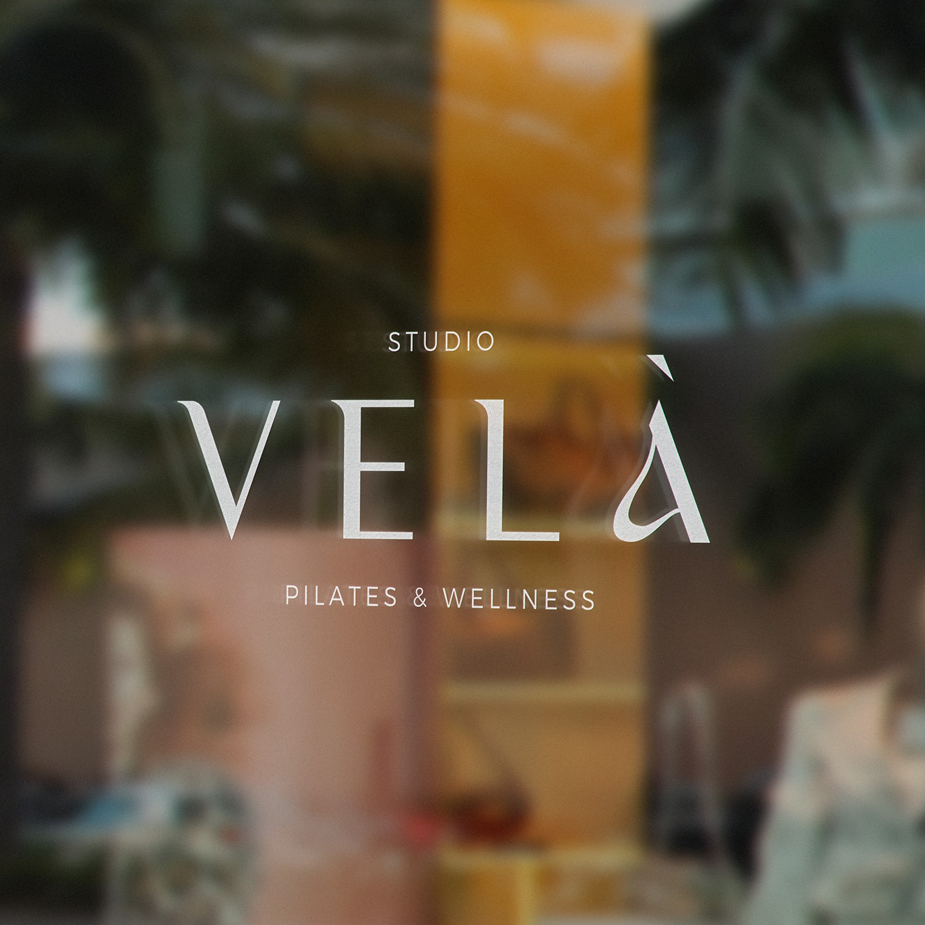
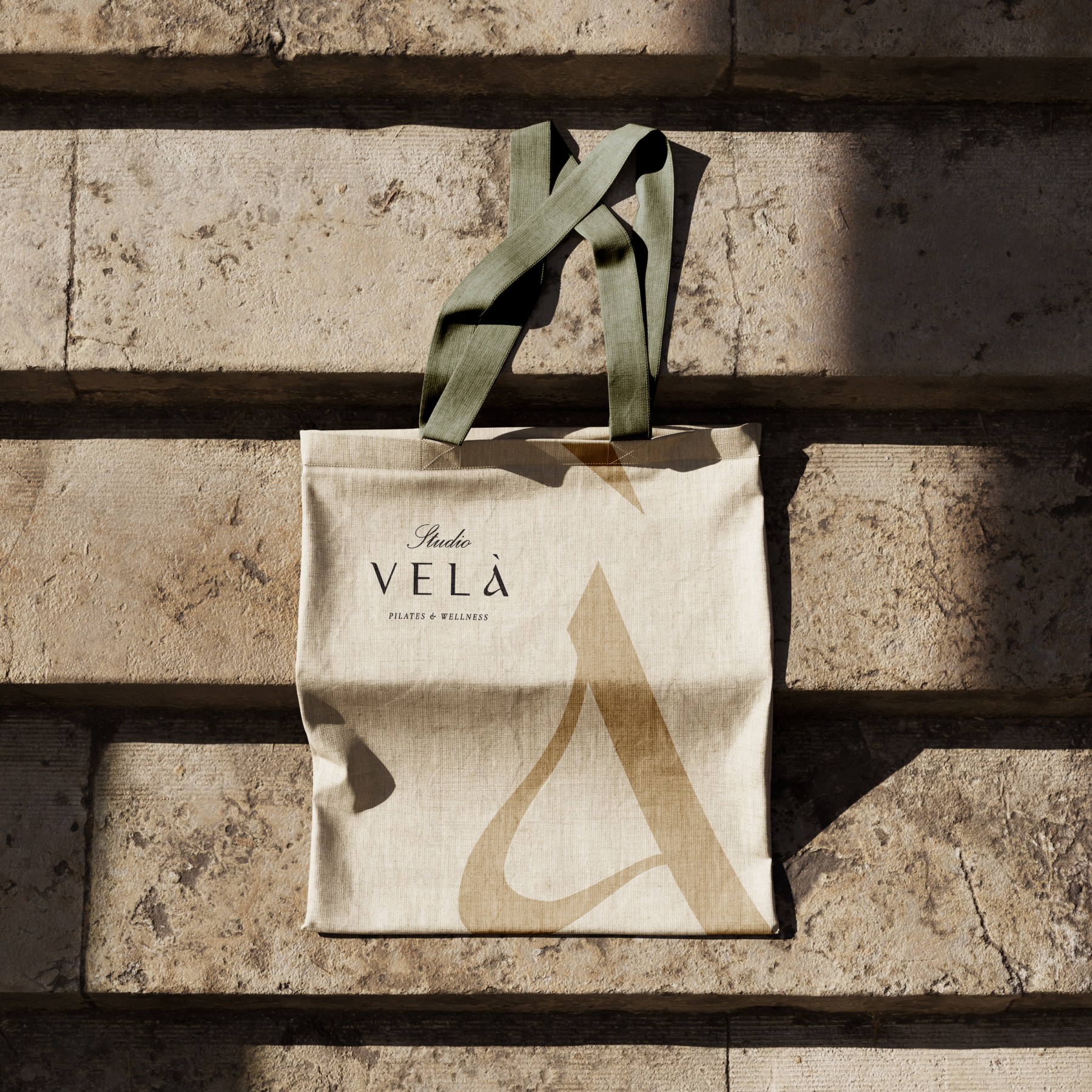
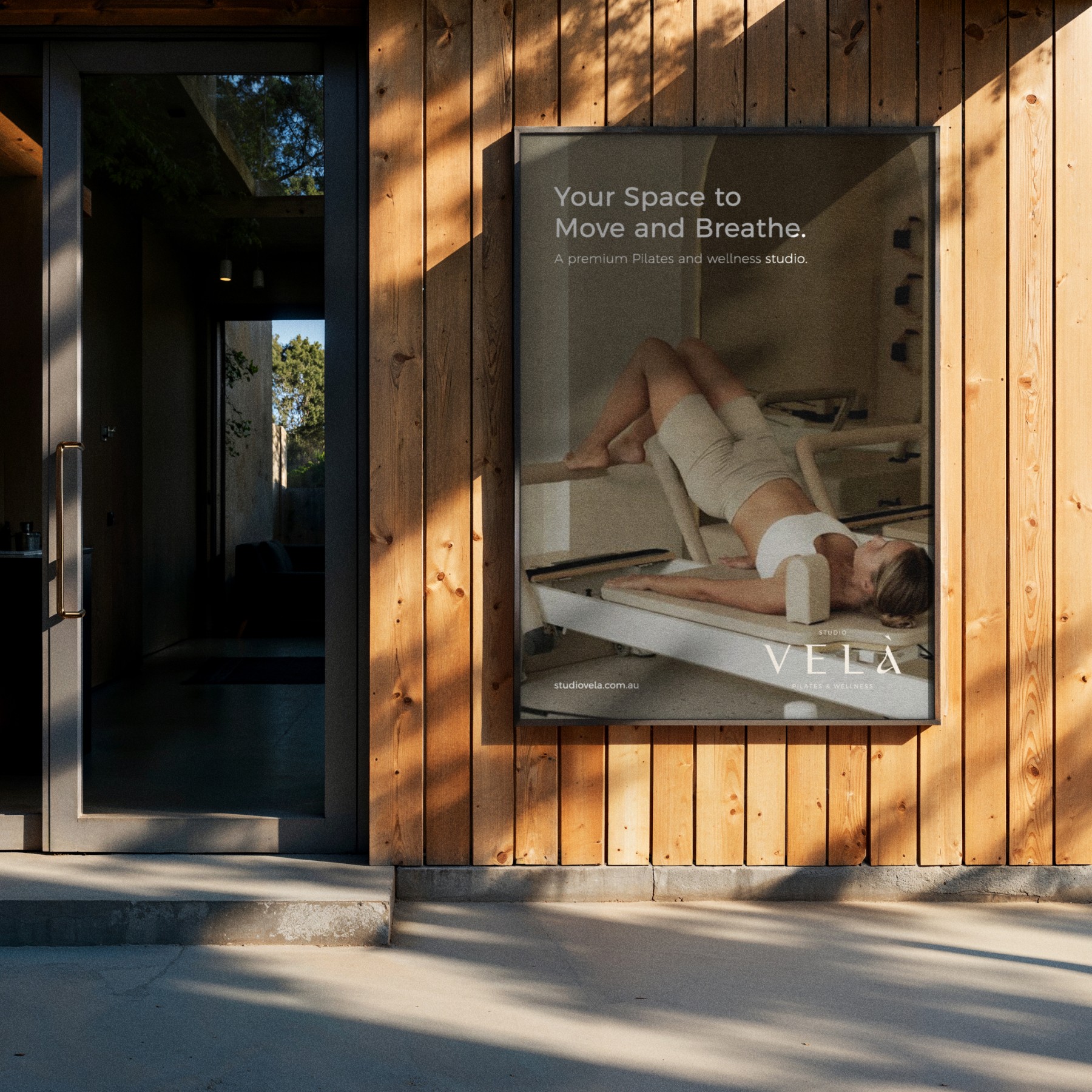
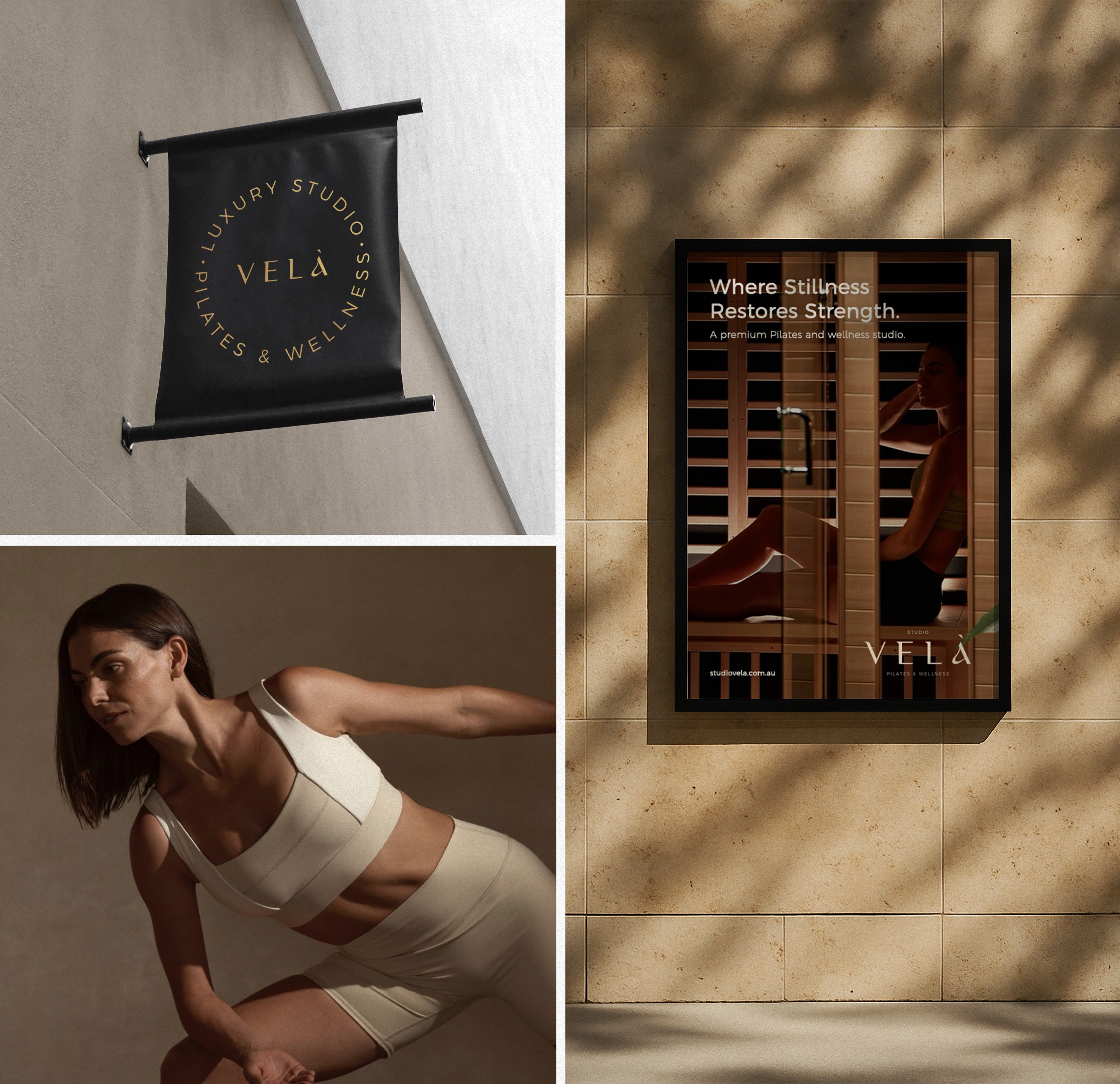
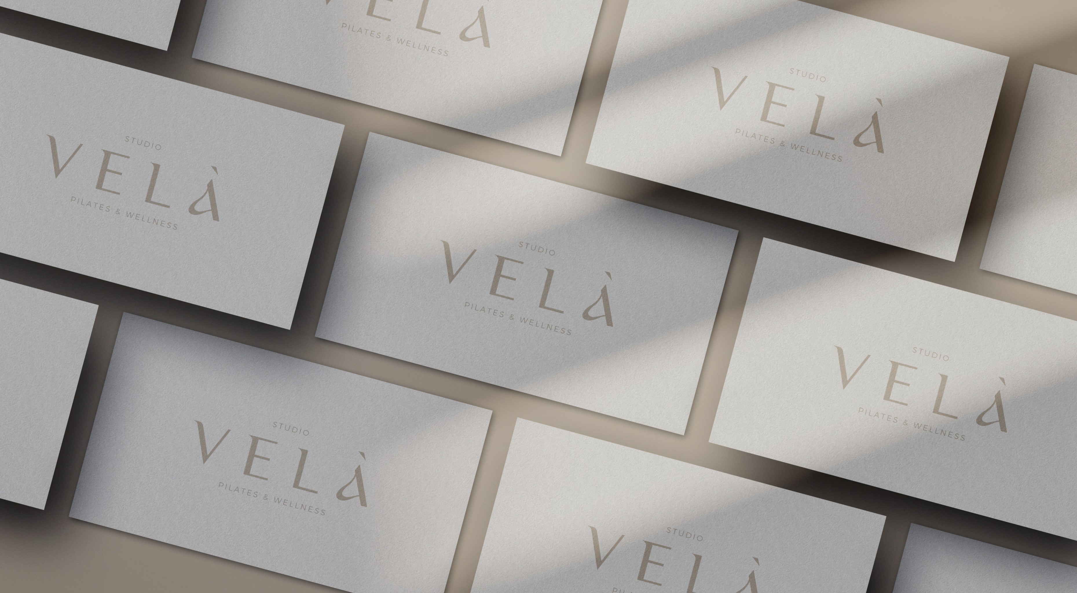
The design process began with immersive research into spatial design, wellness rituals, and emotional tone mapping. I created a bespoke logotype using Luxia Display, a high-contrast serif that gave the brand timeless elegance, while the brand symbol was a custom fusion of the letters V, A, and S, constructed to resemble a flame rising from the à. The final identity system included a refined color palette drawn directly from the interiors, an icon system, a full brand guideline, and collateral design ranging from studio signage to printed materials. Every design decision was made to balance luxury with calm, creating a visual language that feels effortless, elevated, and deeply human.

The design process began with immersive research into spatial design, wellness rituals, and emotional tone mapping. I created a bespoke logotype using Luxia Display, a high-contrast serif that gave the brand timeless elegance, while the brand symbol was a custom fusion of the letters V, A, and S, constructed to resemble a flame rising from the à. The final identity system included a refined color palette drawn directly from the interiors, an icon system, a full brand guideline, and collateral design ranging from studio signage to printed materials. Every design decision was made to balance luxury with calm, creating a visual language that feels effortless, elevated, and deeply human.

The design process began with immersive research into spatial design, wellness rituals, and emotional tone mapping. I created a bespoke logotype using Luxia Display, a high-contrast serif that gave the brand timeless elegance, while the brand symbol was a custom fusion of the letters V, A, and S, constructed to resemble a flame rising from the à. The final identity system included a refined color palette drawn directly from the interiors, an icon system, a full brand guideline, and collateral design ranging from studio signage to printed materials. Every design decision was made to balance luxury with calm, creating a visual language that feels effortless, elevated, and deeply human.

Share:

More works